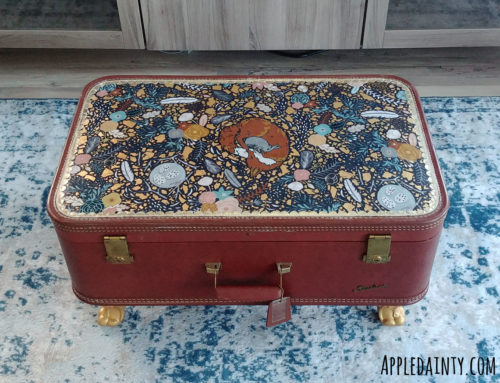
Since we got possession of our townhouse last year Dave and I have been working on renovating and decorating it – although the bulk of the design insanity comes down to me. I’ve finished lots of little projects so far, but this is the biggest one that was on my list – the kitchen.
I started this project with having new countertops, a sink and faucet installed. Then, it was time to paint. The kitchen, dining, and living room are all one shared space. I wanted to give the shared space a unified feel, so I painted the kitchen cabinets with the same color as the lowers of the rest of the living space – a pale blue-white.
Once the painting was done, I installed floral contact paper in the back of the cabinets, added new knobs to all the doors and drawers, and installed some organizational features – vertical plate racks, hook bar for hanging our pans, a slide out trash can, tip out drawer under the sink, and some sliding glass containers for our pantry.
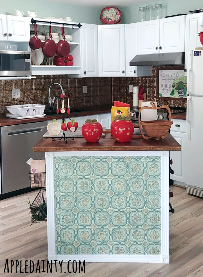
You may have guessed from the name of my website that I like apples. When I was in University, and living on my own, I started a collection of apple themed kitchen items – including dishes, canisters, towels, measuring cups and spoons. I decided to keep this decorative scheme for our current kitchen. Our living space has more touches of blue, and the kitchen/dining area has touches of red, giving the two spaces a bit of visual separation.
I don’t want the house to just be a reflection of my personal design sensibilities. So, Dave and I picked out lots of new things together as well. Dave picked out our new round, shield-like hardware, because they remind him of Paladins – his favorite class of character to play. Dave also picked out the sink and faucet, since he’s the main dishwasher in our family.
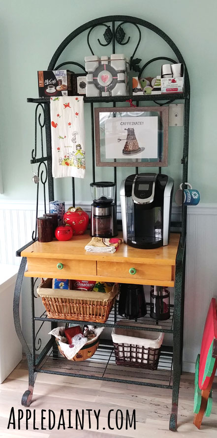
I also turned an old baker’s rack into a coffee station with a few nerdy features – namely the Caffeinate! print by Autogeography, and the Companion Cube Cookie Jar we got from my friend Matt as a wedding gift.
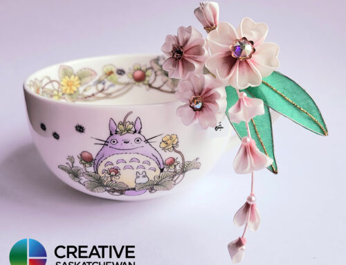
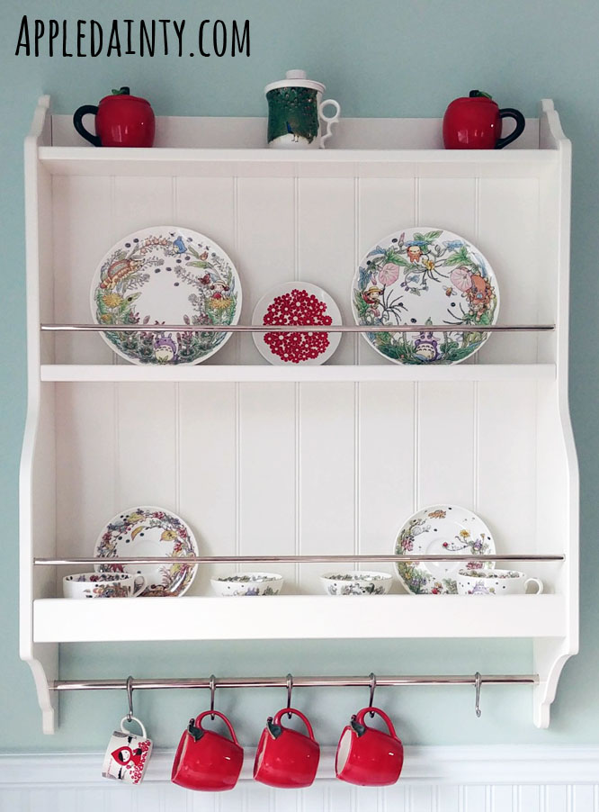
We also put up a new plate rack to store additional coffee cups and display the beautiful Studio Ghibli china we got from the Ghibli Museum during our honeymoon in Japan.
Once all the painting and installing was done, I finally decided on a backsplash. I’d originally planned to use the same 3D wallpaper that I’d used on the back of my kitchen island. But, I soon realized it would probably be better to find a more durable, longer lasting backsplash. I had considered waiting and doing a tile – I was thinking a marble subway tile in a chevron pattern – but eventually decided it was more cost effective to do these tin-tile looking panels from Fasade in bermuda bronze.
They were super easy to install. I cut them using a pair of old scissors, a utility knife, and glued them in place with construction adhesive. I was happy to find that the end caps and corner pieces that Fasade makes are pre-made in the correct size to fit under lower cabinets. I wasn’t sure how I felt about the brassy gold color at first, but I’ve since gotten used to it – and it looks a bit more coppery against the brown of our butcherblock counters.
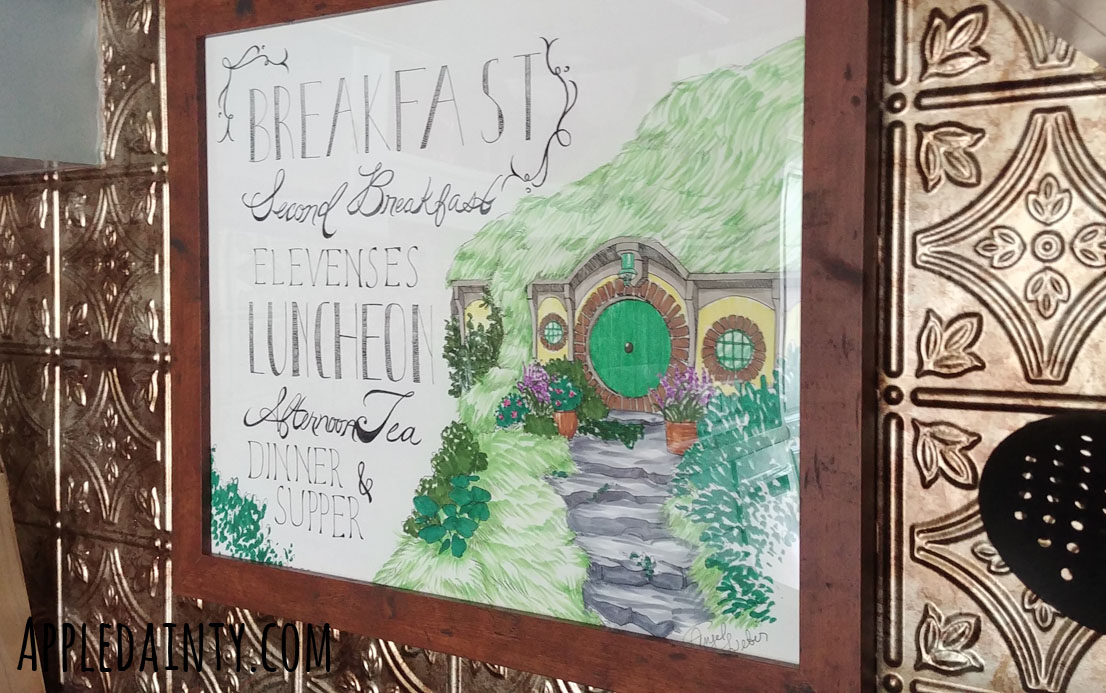
The final touch for our kitchen was creating a piece of art myself to serve as a splash guard to go above our stove, under the range hood. I have a strong affinity for halflings, so I knew I wanted to do something in reference to Tolkien. I landed on a drawing of Bag End with a list of the 7 meals in the hobbit day. I know the books only had 6 meals, but I liked the odd number from the movies so I went with that instead.
It’s not my best work. The lettering is a bit wonky in places, and the pencil didn’t completely erase out in other spots – but with how much my hands hurt when I ink, I am pretty happy that I finished it – and even happier that I can share our finished kitchen with you!
Anyhoo, that is all I’ve got for this week. If you like this blog and want to help support it, consider buying me a coffee. Your support is greatly appreciated, and I hope that you check back again soon for more art, crafts, and creativity!
